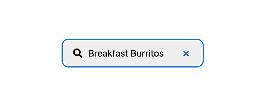
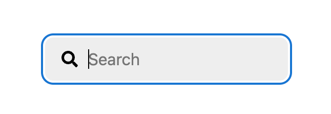
Let’s build a search form that looks like this:


That feels like the absolute bowl-it-down-the-middle search form right now. Looks good but nothing fancy. And yet, coding it in HTML and CSS I don’t think is perfectly intuitive and makes use of a handful of decently modern and slightly lesser used features.
The Label-Wrapping HTML
At a glance, this looks like an <input> all by itself. Perhaps the placeholder text is pushed in with some text-indent or something and an <svg> icon is plopped on top. But no, that’s actually harder than what we’ve done here. Instead we’re going to wrap the input in a label like this:
<label class="searchLabelWrap">
  Search
  <input type="search" placeholder="Search" class="searchInput" name="s">
</label>Code language: HTML, XML (xml)
This wrapping means the label and input are automatically tied to each other (e.g. clicking the label will focus the input) without having to use the for attribute and a matching id.
We’re also using the search type here on the input, which is semantically correct, but also gives us the free UX of having a ✖️ “clear search” icon in the input for free.
Wrapping All That in a Search and Form element
HTML now has a <search> element, so again that’s a semantically smart choice, and we’ll also use a <form> element so that submitting the search can be done with the Enter key. Gotta think UX! If you don’t like the extra wrapper, you could put role="search" on the <form>, but I like it:
<search>
  <form action="/search" method="GET" id="searchForm">
    <label class="searchLabelWrap">
       ...
    </label>
  </form>
</search>
Code language: HTML, XML (xml)
The GET method means it will append our search term as a search parameter which is usually a desirable trait of a search form. The name attribute of the input will be the search param key. That’s looking pretty solid right there.
Hiding the Label, Adding an Icon
We definitely need there to be a text label for the input for screen readers, but since we’ll be visually marking the input with both a visual icon and placeholder text, I think it’s OK to hide the text label while leaving it accessible.
<label class="searchLabelWrap">
  <span class="visually-hidden">Search</span>
  <svg viewBox="0 0 512 512" aria-hidden="true" class="icon">
    <path d="..." />
  </svg>
  <input type="search" placeholder="Search" class="searchInput">
</label>
Code language: HTML, XML (xml)
.visually-hidden {
position: absolute;
left: -9999px;
}Code language: CSS (css)Label Wrapping Styling
Without any CSS, we’re in this sort of situation:

Perfectly functional, but we’ve got work to do. Visually, we want the icon to appear inside the “input” area. So we’ll actually apply the background to the searchLabelWrap instead here, and wipe out all the styling on the input itself. While we’re at it, let’s think about Dark Mode/Light Mode and use the newfangled light-dark() function. This is very new so, ya know, do what you gotta do. We’ll keep things aligned with flexbox and apply very chill other styles:
.searchLabelWrap {
  display: flex;
  gap: 0.5rem;
  background: light-dark(var(--gray-light), var(--gray-dark));
  padding: 0.5rem 1rem;
  border-radius: 0.5rem;
}

.searchInput {
  border: 0;
  outline: 0; /* focus style on parent */
  background: transparent;
  font: inherit;
}Code language: CSS (css)
We’re doing the sin of removing the focus style on the input, which isn’t a very accessible thing to do. So we gotta bring that back!
Focus Within FTW
It’s actually the input itself which receives the :focus, but we can target the parent here instead. Maybe use :has() you say? Like :has(input:focus) could work, but there is actually a cleaner way here:
.searchLabelWrap {
  ...

  &:focus-within {
    outline: 2px solid var(--focus-blue);
    outline-offset: 2px;
  }
}Code language: CSS (css)
I love :focus-within it’s so cool. It was kinda the OG has and it was theorized when it came out that it could be a gateway to :has() and that’s totally what happened.
Also notice the outline-offset there. I think that’s a nice touch to push the somewhat beefy outline away a smidge.

The Icon
I’m a fan of just using inline SVG for icons. No network request and easy to style my friends. Here’s one:
<svg viewBox="0 0 512 512" aria-hidden="true" class="icon" width="
20">
  <path d="M505 442.7L405.3 343c-4.5-4.5-10.6-7-17-7H372c27.6-35.3 44-79.7 44-128C416 93.1 322.9 0 208 0S0 93.1 0 208s93.1 208 208 208c48.3 0 92.7-16.4 128-44v16.3c0 6.4 2.5 12.5 7 17l99.7 99.7c9.4 9.4 24.6 9.4 33.9 0l28.3-28.3c9.4-9.4 9.4-24.6.1-34zM208 336c-70.7 0-128-57.2-128-128 0-70.7 57.2-128 128-128 70.7 0 128 57.2 128 128 0 70.7-57.2 128-128 128z" />
</svg>Code language: HTML, XML (xml)
I like tossing a width on there because an <svg> with a viewBox before CSS loads can load super wide on the screen and it’s akward. CSS will come in and make it right here:
.icon {
  width: 1rem;
  aspect-ratio: 1;
  fill: currentColor;
}Code language: CSS (css)
You could apply different styling, but here I’m making the icon text follow the text color so it’s easier to update. The icon is also essentially in a square area hence the simple aspect-ratio.
Colors
I used a few --custom-properties as we went. I’ll define them here at the root, as well as ensure our page knows we’re intending to support both modes:
html {
  color-scheme: light dark;

  --gray-light: #eee;
  --gray-dark: #333;
  --focus-blue: #1976d2;
}

body {
  background: light-dark(white, black);
  color: light-dark(black, white);
  font: 100%/1.5 system-ui, sans-serif;
}Code language: CSS (css)
That’ll do use nicely, finishing things off.

