Creating unusual shapes is always a fun exercise and a good way to practice your CSS skills. One might argue that SVG is better for this job, but nowadays we have a lot of new CSS tricks that allow us to create shapes with a clean and optimized code. Through this two-article series, we will explore what can be done with CSS nowadays.
Article Series
In this article, we are going to create flower-like shapes. We are going to rely on modern features like mask, trigonometric functions, CSS variables, etc.
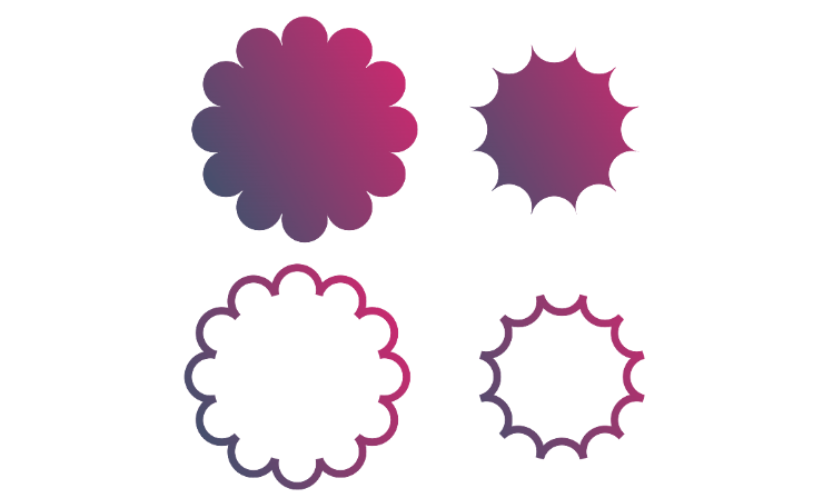
Before we start, you can take a look at my online generator for flower shapes to get an overview of what we are building here. You can easily define your settings and get the CSS code in no time. Some of the code we will be writing can be complex so it’s always good to have a generator to make our life easy. That said I invite you to keep reading to understand the logic behind the code you are copying and be able to tweak it if needed.
The Geometry of A Flower Shape
The structure of the flower shape can be seen as small circles placed around a bigger one.
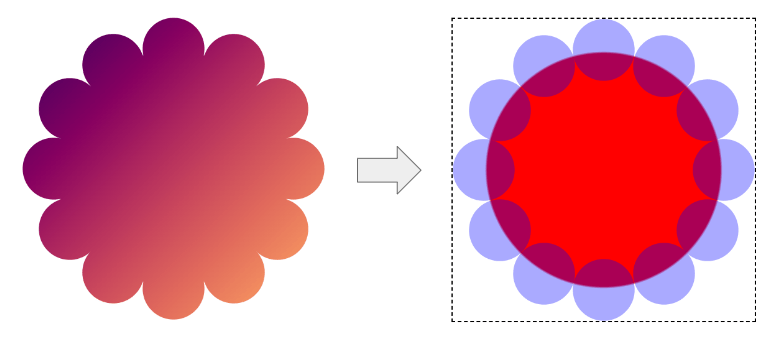
Consider that the small circles touch each other without overlapping each other. This will make the calculation a bit challenging as we will need accurate formulas. Turns out this is a perfect use case for trigonometric functions in CSS.
The shape can be controlled using 2 variables; the number of small circles (N) and their radius (R). From there we can identify the size of the whole shape and the radius of the big circle.
Here is a figure to illustrate some of the values and from where we can extract the different formulas.
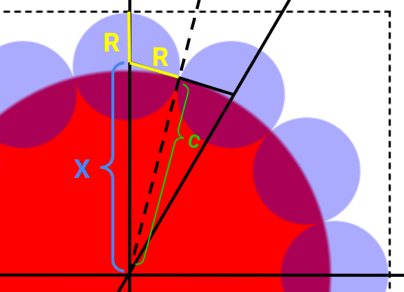
I won’t start a boring geometry course so I will jump straight to the formulas we need to use. The size of the element is equal to
2 * (X + R) = 2 * (R/sin(180deg/N) + R) = 2 * R * (1 + 1/sin(180deg/N))Code language: CSS (css)and the radius of the big circle is equal to
C = R/tan(180deg/N)Code language: CSS (css)We have all that we need to start writing some code.
Coding The Shape
The main challenge is to rely on a single element. We are not going to consider a complex HTML structure where each circle is a different element. Instead, we will only use one element (and no pseudo-elements either!)
I mentioned mask, we’ll be using that, and gradients will allow us to do the shape drawing we want to do. Since it’s all about circles we are going to use radial-gradient(). We will also use a bit of Sass (for the looping feature) to control the number of circles. The number of gradients will depend on the number of circles and with Sass we can write a loop to generate the needed gradients.
Let’s start by setting the different variables and the shape size:
$n: 12; /* the number of circles/petals */

.flower {
  --r: 30px; /* the radius of the small circles */
  width: calc(2*var(--r)*(1 + 1/sin(180deg/#{$n})));
  aspect-ratio: 1;
  mask: radial-gradient(#000 calc(var(--r)/tan(180deg/#{$n})),#0000 0);
  background: /* you background coloration */
}
Code language: CSS (css)
Nothing fancy so far, we simply translated the previous formulas using code. I also added the big circle so all that we are missing is the small ones. The Sass code to generate them will look like this:
$m: (); /* empty variable */
@for $i from 1 through ($n) { /* loop through the number of circles*/
  $m: append($m,
    radial-gradient(50% 50%,#000 100%,#0000) no-repeat
    x y / calc(2*var(--r)) calc(2*var(--r)),
  comma);
}
Code language: SCSS (scss)
--r defines the radius so the size of each gradient will be equal to calc(2*var(--r)). Then we need to identify the position of each gradient (the x y).
Here as well, we need to consider some geometry formulas
x = calc(50% + 50%*cos(360deg*#{$i/$n}))
y = calc(50% + 50%*sin(360deg*#{$i/$n}))Code language: SCSS (scss)
The final code will be:
$n: 6; /* the number of circles/petals */

.flower {
  --r: 30px; /* the radius of the small circles */
  width: calc(2*var(--r)*(1 + 1/sin(180deg/#{$n})));
  aspect-ratio: 1;
  $m: (); /* empty variable */
  @for $i from 1 through ($n) { /* loop through the number of circles*/
    $m: append($m,
      radial-gradient(50% 50%,#000 100%,#0000) no-repeat
      calc(50% + 50%*cos(360deg*#{$i/$n}))
      calc(50% + 50%*sin(360deg*#{$i/$n}))
     / calc(2*var(--r)) calc(2*var(--r)),
    comma);
  }
  mask: radial-gradient(#000 calc(var(--r)/tan(180deg/#{$n})),#0000 0),{$m};
  background: /* you background coloration */
}Code language: SCSS (scss)
Note how the mask property takes the value generated using Sass in addition to the gradient that creates the big circle.
Our shape is done!
The size of the shape is controlled by the radius of the small circles but we can do the opposite which is probably more convenient since we generally want to control the width/height of our element.
.flower {
  --w: 200px; /* the size */
  --r: calc(var(--w)/(2*(1 + 1/sin(180deg/#{$n}))));
  width: var(--w);
  /* same as before */
}Code language: CSS (css)We can even optimize the previous code a little and get rid the of --w variable. The latter is defining the width/height of the element and gradients can access such value using percentages we can write the code like below:
$n: 12; /* the number of circles/petals */

.flower {
  width: 300px; /* the size */
  --r: calc(50%/(1 + 1/sin(180deg/#{$n}))); /* using percentage instead of --w */
  aspect-ratio: 1;
  $m: (); /* empty variable */
  @for $i from 1 through ($n) { /* loop through the number of circles*/
    $m: append($m,
      radial-gradient(50% 50%,#000 100%,#0000) no-repeat
      calc(50% + 50%*cos(360deg*#{$i/$n}))
      calc(50% + 50%*sin(360deg*#{$i/$n}))
     / calc(2*var(--r)) calc(2*var(--r)),
    comma);
  }
  mask: radial-gradient(100% 100%,#000 calc(var(--r)/tan(180deg/#{$n})),#0000 0),#{$m};
}Code language: SCSS (scss)
Now by adjusting the width you control the size of the whole shape. Here is an interactive demo where you can resize the element and see how the shape adjusts automatically. Try it below with the resizer handle on the bottom right of the box:
Voilà! We did a nice flower shape without hack or complex code and you can easily control it by adjusting a few variables. You either use the above code or you consider my online generator to get the generated CSS without the variables and Sass.
Inverting the shape
Let’s try a different shape this time. It’s somehow the invert of the previous one where the circular part is going inside instead of outside. Well, a figure worth a thousand words.
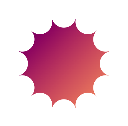
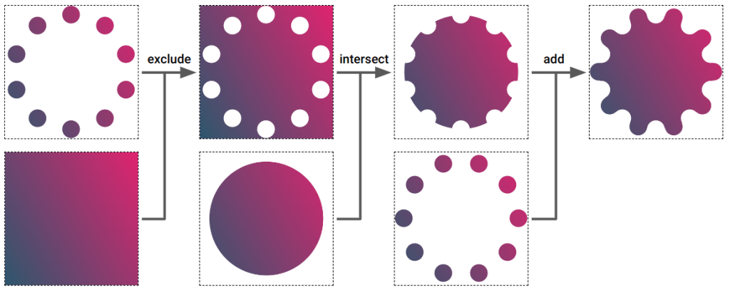
The code to get the above shape is almost the same as the previous one. We are going to introduce an extra gradient and play with mask-composite. The idea is to cut the small circles from the bigger one.
Here is a figure to illustrate the process:
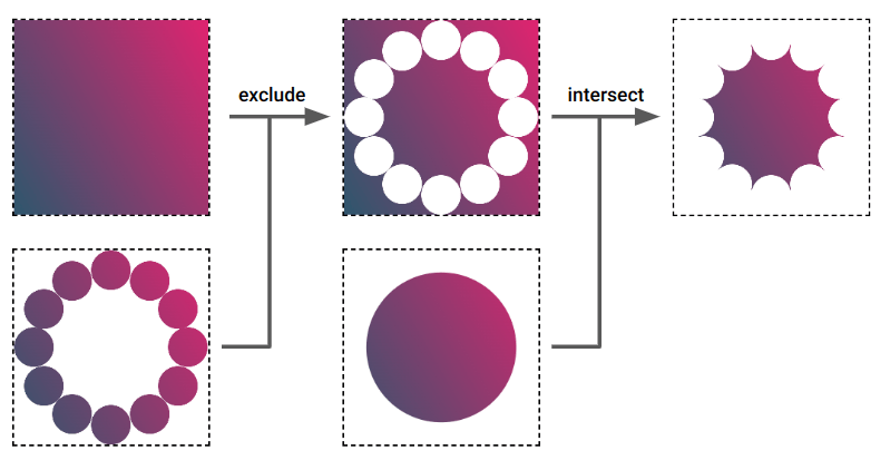
We will perform two compositions. For the first one, we consider a gradient that fills the whole area and the set of small circles. We “exclude” one from another to get a shape where the small circles are now holes. In other words, the small circles are now the invisible part of our shape.
From there, we consider the gradient that creates the big circle and we do an “intersect” this time to show only the middle area and get our final shape.
The code of mask will look like the below
mask:
 radial-gradient(100% 100%,#000 calc(var(--r)/tan(180deg/#{$n})),#0000 0) intersect,
 radial-gradient(#000 0 0) exclude,
 #{$m};Code language: CSS (css)
And here is the one of the previous shape to compare both
mask:
 radial-gradient(100% 100%,#000 calc(var(--r)/tan(180deg/#{$n})),#0000 0),
 #{$m};Code language: CSS (css)
The only difference is an extra gradient (the one that will fill the whole shape) and the value of mask-composite. And since the remaining code is also the same, we can introduce a variable to control which one to use:
$n: 12; /* the number of circles/petals */

.flower {
  width: 300px;
  aspect-ratio: 1;
  --r: calc(50%/(1 + 1/sin(180deg/#{$n})));
  $m: (); /* empty variable */
  @for $i from 1 through ($n) { /* loop through the number of circles*/
    $m: append($m,
      radial-gradient(50% 50%,#000 100%,#0000) no-repeat
      calc(50% + 50%*cos(360deg*#{$i/$n}))
      calc(50% + 50%*sin(360deg*#{$i/$n}))
     / calc(2*var(--r)) calc(2*var(--r)),
    comma);
  }
  mask: radial-gradient(100% 100%,#000 calc(var(--r)/tan(180deg/#{$n})),#0000 0) var(--alt,),#{$m};
}
.alt {
  --alt: intersect,radial-gradient(#000 0 0) exclude;
}Code language: SCSS (scss)The var(--alt,) will default to nothing when the variable is not specified and we get the code of the first shape. By adding the extra gradient and the composition values, we get the second shape. Two different shapes with almost the same code.
The Border-Only Version
Now let’s tackle the border-only version of the previous shapes. We are also going to rely on mask-composite and the same code structure.
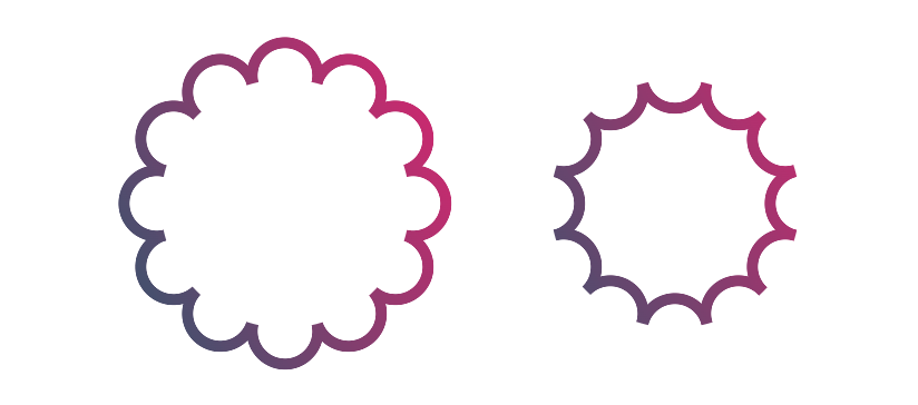
First of all, let’s introduce a new variable to control the border thickness and update the code that generates the small circles.
$n: 12; /* the number of circles/petals */

.flower {
  --b: 10px; /* the border thickness*/

  width: 300px;
  aspect-ratio: 1;
  --r: calc(50%/(1 + 1/sin(180deg/#{$n})));
  $m: (); /* empty variable */
  @for $i from 1 through ($n) { /* loop through the number of circles*/
    $m: append($m,
      radial-gradient(50% 50%,#0000 calc(100% - var(--b)),#000 0 100%,#0000) no-repeat
      calc(50% + 50%*cos(360deg*#{$i/$n}))
      calc(50% + 50%*sin(360deg*#{$i/$n}))
     / calc(2*var(--r)) calc(2*var(--r)),
    comma);
  }
  mask: #{$m};
}Code language: SCSS (scss)Nothing complex so far. Instead of full circles, we are getting a border-only version. This time we don’t want them to touch each other but rather overlap a bit to have a continuous shape.
We need to increase the radius a little from this
--r: calc(50%/(1 + 1/sin(180deg/#{$n})));Code language: SCSS (scss)To this:
--r:calc((50% + var(--b)/(2*sin(180deg/#{$n})))/(1 + 1/sin(180deg/#{$n})));Code language: SCSS (scss)Again some geometry stuff but you don’t really need to accurately understand all the formulas. I did the hard work to identify them and you only need to understand the main trick. In the end, all you have to do is update a few variables to control the shape or get the code from my generator.
The result so far:
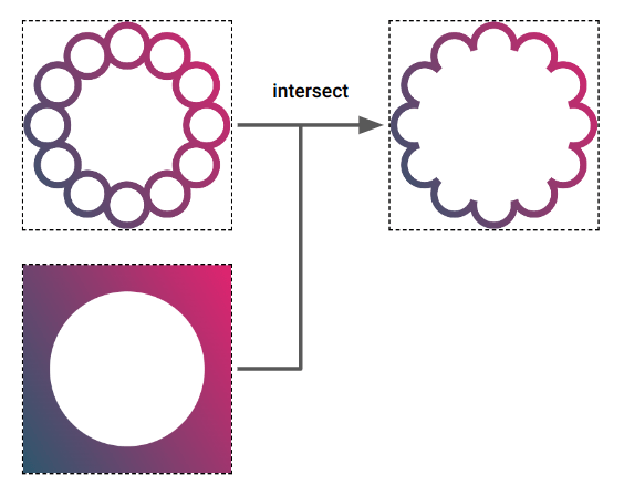
Now, we use mask-composite with another gradient to hide some parts and get our final shapes. Here is a figure to illustrate the process for both shapes.
For the first shape:
And for the second one:
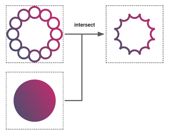
In both cases, I am introducing an extra gradient that will intersect with the small circles. The difference between each shape is the coloration of the extra gradient. In the first case, we have transparent inside and filling outside and for the second case, we have the opposite.
/* first shape */
mask:
 radial-gradient(100% 100%,#0000 calc(var(--r)/tan(180deg/#{$n}) - var(--b)/(2*tan(180deg/#{$n}))),#000 0) intersect,
 #{$m};
/* second shape */
mask:
 radial-gradient(100% 100%,#000 calc(var(--r)/tan(180deg/#{$n}) - var(--b)/(2*tan(180deg/#{$n}))),#0000 0) intersect,
 #{$m};
Code language: SCSS (scss)
And here is the full code with both variations:
If you have some trouble visualizing how mask-composite works, I invite you to read the crash course written by Ana Tudor where you will find a more in-depth exploration.
One More Shape
Another flower? Let’s go!

This time, it’s your turn to figure out the code. Consider this as a small piece of homework to practice what we have learned together. As a hint, here is a figure that illustrates the mask-composite you need to perform, or maybe you will figure out another idea! If so don’t hesitate to share it in the comment section
Here is the code of my implementation but make a try before checking it so you can compare your method with mine. Take the time to study this last example because it will be the starting point of our second article.
Conclusion
I hope you enjoyed this little experimentation using CSS mask and trigonometric functions. You are probably not going to use such shapes in a real project but creating them is a good way to learn new features. If you have to remember one thing from this article it’s the use of mask-composite. It’s a powerful property that can help you create complex shapes.
It is worth noting that since we are using mask, we can easily apply our shape to image elements.
Don’t forget to bookmark my flower shapes generator so you can easily grab the code whenever you need it. I also have more CSS generators that invite you to check. Most of them rely on CSS mask as well and I have a detailed article linked to each one.
I will close this article with a few mesmerizing animations involving some flower shapes.

