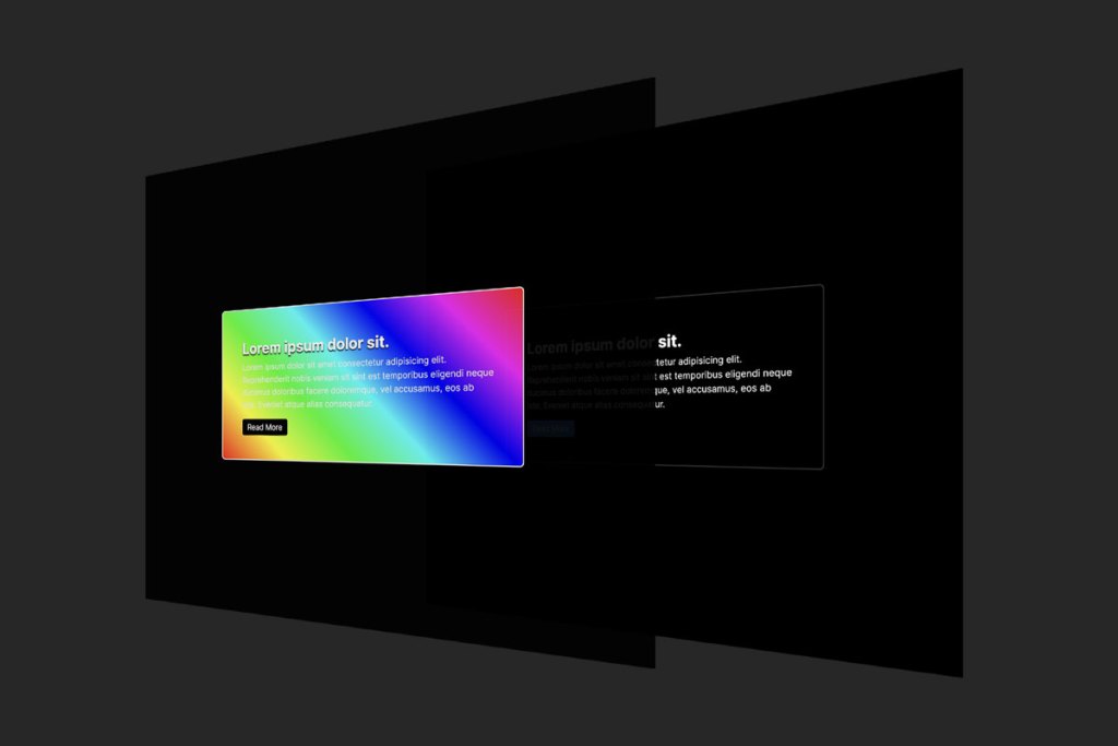
One of the Top Pens of 2023 was this Glowy Hover Effect by Ines. When I was taking a look at it, it finally clicked how it works. In a nutshell, there are two copies of the same HTML layered on top of one another. The top one has a fancy colors and such, but it ultimately “masked” such that you can only see part of it at a time. As you move the pointer around, the mask moves with it, making it look like the glowing is happening wherever the pointer is.
Let’s do it step by step. And again, this is just my own explanation of how Ines pulled this off.
1) Duplicate and Hide Another Layer of HTML
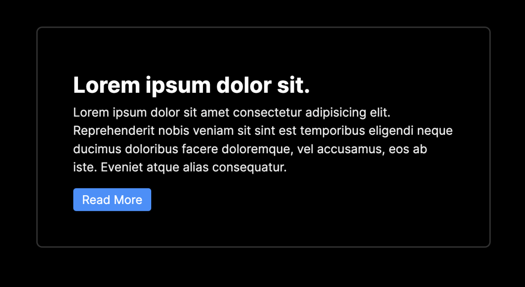
To keep this simple, let’s say we’re dealing with a single Card element.

Our job is to duplicate the HTML that produces this, and place it directly on top of the original.
<main id="main">

  <div class="card">
    <h2>Lorem ipsum dolor sit.</h2>
    <p>Lorem ipsum dolor sit amet consectetur adipisicing elit. Reprehenderit nobis veniam sit sint est temporibus eligendi neque ducimus doloribus facere doloremque, vel accusamus, eos ab iste. Eveniet atque alias consequatur.</p>
    <button>Read More</button>
  </div>

  <div class="overlay" aria-hidden="true">
    <!-- duplicate will go here -->
  </div>

</main>Code language: HTML, XML (xml)
Above we have the original HTML, and a place to put the duplicated HTML. We can ensure the duplicate is exactly on top, in this setup, like:
main {
  position: relative;
}

.overlay {
  position: absolute;
  inset: 0;
}Code language: CSS (css)
Then we’ll do the actual duplication like:
const main = document.querySelector("#main");
const content = main.querySelector(":scope > *");
const clone = content.cloneNode(true);
const overlay = document.querySelector(".overlay");
overlay.insertAdjacentElement("beforeend", clone);Code language: JavaScript (javascript)
I chose to use cloneNode here in case we wanted do manipulate the HTML in any way before inserting. We’re not really doing that here, so we could have used innerHTML and insertAdjacentHTML instead, but whatever, always multiple ways to crack an egg.
Now we’ve got our two copies.

See how I’ve made the top layer all full of colors. That’s the one we’ll reveal only parts of to achieve this effect.
2) Hide the Top Layer in a Mask
That whole top layer is in an <div class="overlay" aria-hidden="true">. The aria-hidden attribute is there because that bit of HTML should be entirely ignored by screen readers.
The overlay class is what gives us an opportunity to do fancy styling.
.card {
  /* default styling */
  max-width: 50ch;
  border: 2px solid #333;
  padding: 3rem;
  border-radius: 0.5rem;

  /* hover mask styling */
  .overlay & {
    background: linear-gradient(
      45deg,
      hsl(0, 100%, 50%),
      hsl(60, 100%, 50%),
      hsl(120, 100%, 50%),
      hsl(180, 100%, 50%),
      hsl(240, 100%, 50%),
      hsl(300, 100%, 50%),
      hsl(360, 100%, 50%)
    );
    border-color: white;
  }
}Code language: CSS (css)
The trick to mostly hide the overlay element is the masking. But we’ll also make sure it’s entirely visual and doesn’t snag any clicks or anything.
.overlay {
  position: absolute;
  inset: 0;

  /* visual only, don't steal clicks or interactions */
  pointer-events: none;
  user-select: none;

  /* JavaScript will make this visible. This ensures progressive enhancement */
  opacity: var(--opacity, 0);

  -webkit-mask: radial-gradient(
    25rem 25rem at var(--x) var(--y),
    #000 1%,
    transparent 50%
  );
  mask: radial-gradient(
    25rem 25rem at var(--x) var(--y),
    #000 1%,
    transparent 50%
  );

  /* smooooooth */
  transition: 400ms mask ease;
  will-change: mask;
}Code language: CSS (css)
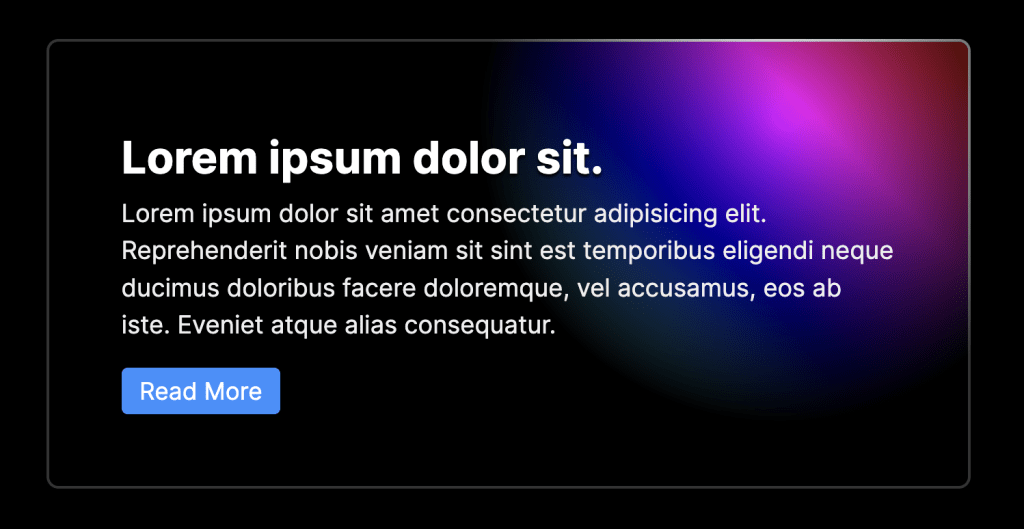
So now we can only see a part of the overlay, a circular 25rem bit, as per the mask:

3) Positioning the Mask
But how does it know where to put the center of that mask? Well note the var(--x) var(--y) coordinates! Those are set in JavaScript:
const applyOverlayMask = (e) => {
  const overlayEl = e.currentTarget;
  const x = e.pageX - main.offsetLeft;
  const y = e.pageY - main.offsetTop;
  overlayEl.style = `--opacity: 1; --x: ${x}px; --y:${y}px;`;
};

document.body.addEventListener("pointermove", applyOverlayMask);Code language: JavaScript (javascript)
Now it follows the pointer around.

