OK it’s HTML time! I love HTML time. We’re laying down a foundation that makes everything feel very real.
Article Series
- Building a TODO App from Scratch — Step 1 — Planning & Design
- Building a TODO App from Scratch — Step 2 — HTML
- Building a TODO App from Scratch — Step 3 — Basic JavaScript Functionality
- Building a TODO App from Scratch — Step 4 — Styling & Interactive Choices
- Building a TODO App from Scratch — Step 5 — Extra Functionality
Is HTML jumping the gun?
Nah.
The reason that we can jump to HTML right away is that it is common to any other future choice we make. As I mentioned, we might just stay in entirely vanilla land, but let’s say we chose a JavaScript framework instead. Those frameworks will likely all have their own slightly special takes on HTML.
- If we pick Vue it might have funny attributes like
@input,:value, orv-for - If we pick React we might be using JSX and have funny attributes like
classNameoronClickand we might see.map()a lot. - If we pick Svelte we might see stuff like
on:clickand{#if}blocks.
Even if we go with native Web Components, we’ll see attributes you might not see every day like part and elements like <slot />.
But… it doesn’t really matter. All of them really need to start with solid semantic and accessible HTML, and no matter what other choices we make, we can acquiesce to their specific syntax.
The Parts
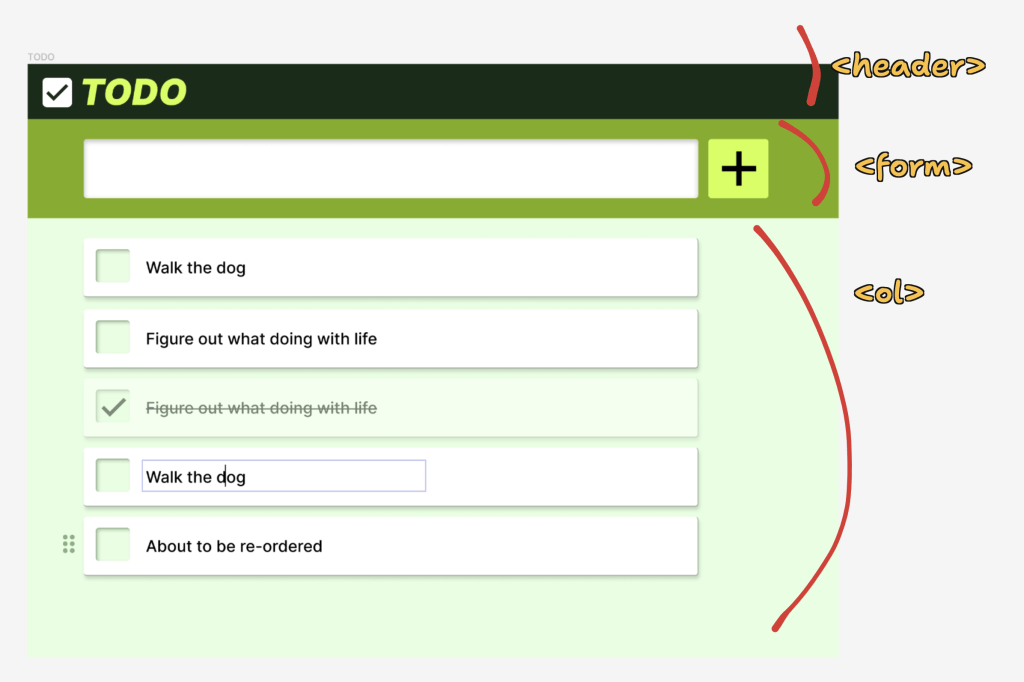
We can look at our very simple design and get a sense for the main parts of the HTML:

The Header
The header is just a decorative thing. Maybe something like:
<header>
  <svg ... />
  <h1>TODO</h1>
</header>Code language: HTML, XML (xml)
The <h1> is perhaps a little controversial. I often prefer “saving” that for whatever the main focus of the page is. But in this case since the name of the app is doing that for us, it kinda works. Otherwise a <div> or whatever is fine here.
The Form
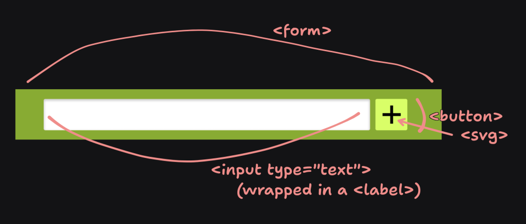
The <form> feels vitally important to me. Already in poking around at other web-based to-do apps I’ve seen some inaccessible forms which feels sad to me for something so simple.
The trick is:
- Actually using a
<form>. - Making sure the
<input>is properly<label>ed. - Offering a submit
<button>.

<form id="todo-form" class="todo-form">
  <label>
    <span class="screen-reader-text">New TODO</span>
    <input type="text" name="todo">
  </label>
  <button>Add</button>
</form>Code language: JavaScript (javascript)
I like having the id on the form for getting our hands on it in JavaScript like we’re likely going to want to. We can make the interactive event of adding a new to-do happen on the submit event. Plus that makes us ready for potentially adding more information into the form later if we wanted, like, say, a date picker for a deadline. The submit event will still work great for us, instead of something more specific like watching for the enter key being pressed while any specific input is focused.
I added the class for styling. That’s just a habit of mine, preferring to style with mostly classes for fairly flat specificity. If you have your own methods or use Tailwind or whatever, you likely already know what you’re doing and godspeed.
Notice my <label> doesn’t have a for attribute like you normally see, and that’s because the <input> is nested within it, which is a valid pattern. I like the pattern as it’s one less thing to screw up.
The actual text of the label we’re hiding, as-per the design. That’s also a little controversial, but I think is generally fine. It’s fairly clear what this form does, and if you were using a screen reader, the actual label text is still there even if we do hide it visually with CSS.
Last, the <button> is a lone wolf within the form, and that’ll make it be a submit button automatically. We could use an <input type="submit" /> as well, which is fine, but I like buttons. You can put more stuff in them and their type is implied in simple situations like this.
The List
The interesting thing about the list is that it’s going to be dynamically generated. We’ll have as many to-do list items as our data tells us. We can start with just the wrapper:
<ol id="todo-list" class="todo-list"></ol>Code language: HTML, XML (xml)Again using the ol’ id/class one two punch there. I feel like an ordered list is appropriate somehow. Especially if we eventually add sorting of the list, then the order is very intentional and deserves that treatment. And the fact that we’re using a list at all feels right. Lists announce themselves as such in screen readers, including how many items are in the list, which may be a useful bit of information. That’s more than a bunch of <div>s would do!
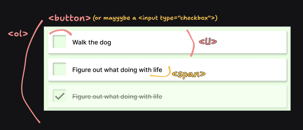
The each list item becomes a <li>, but the extra stuff in there is going to beef it up. Let’s pause on the re-ordering and edit-ability for now and just focus on the item and the ability to complete it.

<li id="something-unique">
  <button aria-label="Complete">
    <svg ... />
  </button>
  To-do text
</li>Code language: HTML, XML (xml)
I figure each list item will have a unique ID on it. Actions taken on it will need to be unique to that item so that’ll be the main identifier. Maybe we don’t need it yet but we probably will. No class name here as I feel like selecting .todo-list > li is probably fine. We could always add it.
Our design makes the interactive element to complete a to-do look like a checkbox, and we could use an <input type="checkbox" />, but I’m kinda torn. This is where visual design and interactive design collide. We didn’t think out the interaction of completing a to-do all the way. What happens when you click that thing? Does it instantly get marked as done? Then disappear? Maybe it instantly gets marked as done but doesn’t disappear from the list. Or maybe there is like a 5-second countdown before it gets removed, so you have a chance to undo it in case it was a mistake.
I kinda like the delay idea, which to me leads me more toward the path of using an <input type="checkbox"> for that with the very obvious two states. We could really do it either way. If we keep the <button>, we’d just need to make sure to use an aria-pressed role for the two states accordingly.
Lastly, the position of that interactive element I have listed first here, before the text of the to-do, because that’s how it looks in the design. I could see the case being made though that in the HTML it should come after, just so that it reads nicer. Like as you tab through the list, you’d potentially hear the list item and then the button text offering to complete it. I’m not 100% sure what the right answer is there, so I think we’ll leave it first, because that’s the visual order, and I’ve heard it’s often best to match the source order and visual order.
Let’s stop there
With some very light wireframe-y CSS applied to those classes, we get this:
That’s a nice little foundation to layer on some styles and then get into the actual functionality. But aren’t you glad we have this strong foundation first? We could go anywhere from here.
Article Series
- Building a TODO App from Scratch — Step 1 — Planning & Design
- Building a TODO App from Scratch — Step 2 — HTML
- Building a TODO App from Scratch — Step 3 — Basic JavaScript Functionality
- Building a TODO App from Scratch — Step 4 — Styling & Interactive Choices
- Building a TODO App from Scratch — Step 5 — Extra Functionality

