I find it fascinating how websites come to be. Especially websites with user interactivity and functionality, there are so many things to plan, build, and maintain, that it’s no wonder it easily makes for a whole career.
Perhaps one of the most cliché introductory things to build on the web (or otherwise), is a to-do app. But we’re going to do it again, as a website, and for good reason: it’s the perfect scope. A to-do app is fairly simple, adding and removing short bits of text forming a list. But it’s not too simple. It requires us to think about all sorts of things. While we’re ultimately going to care about coxre web development technologies like HTML & CSS, we’re going to choose to layer in JavaScript to help with user experience and data handling, and then see what other technology we might find helpful along the way, if any.
We’ll call our project TODO. Don’t sue me. It’s just for learning.
And we’re going to do this thing as a series, so this list of posts will be updated as they are completed.
Article Series
- Building a TODO App from Scratch — Step 1 — Planning & Design
- Building a TODO App from Scratch — Step 2 — HTML
- Building a TODO App from Scratch — Step 3 — Basic JavaScript Functionality
- Building a TODO App from Scratch — Step 4 — Styling & Interactive Choices
- Building a TODO App from Scratch — Step 5 — Extra Functionality
Prior Art
Marc has already broached this subject on this very blog. Go check out the GitHub repo, where there is a lot of code to explore. Marc went deeper on the JavaScript aspect than we likely will. He tells me:
I added branches for TypeScript support, used lit-html for performant rendering, and an app-architecture branch for how to architect larger apps
There is also an extremely cool project called TodoMVC that was hot’n’heavy around 2012-2016. The purpose of it was comparing different approaches of a to-do app created using different JavaScript frameworks and vanilla approaches.
TodoMVC is useful for comparing syntax and solutions, is officially used in cross-browser benchmarks.
It was/is useful in helping people decide things like “Do I like the Angular approach or the React approach?”, for example. People could decide by looking at the actual code as well as seeing/feeling the output. We might fiddle with those ideas a little, but we’ll be focusing more on the thinking and experience of building and leaning toward vanilla code.
There are no wrong answers
We’re going to take an intentionally wordy trip through this project. We’re going to think about lots of different aspects of product development and web design and development. We’re going to do it in a certain order and land on certain choices.
If you were going to build a to-do app of your own, you might think about things differently. You might make different choices. You might do these things in a different order than I’m doing them. I think there is a rhyme and reason to the path I’ll write about, but that doesn’t make yours wrong. In fact, I think finding your own way is a great way to learn, and probably what you’d do anyway regardless of anything you read.
So unless what you build is broken or inaccessible, there is no wrong way.
Design: Thinking First
I like putting design first, design-driven development as it were, and here’s why. Design forces you to think about your app more holistically than you might otherwise.
When I started thinking about this idea, admittedly, I started poking around at JavaScript right away, putting some basic HTML together the JavaScript could work with. I was having fun reminding myself how powerful native web tech has become and how much we can do without reaching for anything else at all. But then things started to feel sloppy as I realized I was just randomly poking at things rather than have any actual plan. Sure, I could add new to-do items to a list, then remove them. But oh yeah I need to display the list from saved data. And then what else? Can you re-order them? Can you edit them? Can you delete multiple at once? That’s just scratching the surface. Design allows you to take a beat, stop thinking about implementations, and think of a plan first.
A Look Around
There is no shortage of to-do apps. It’s not like we wouldn’t be able to piece it together with our own thoughts of what should be in an app like this, but don’t let that confidence fool you! It’s always worth a look around to see how other apps are doing things, particularly successful ones because those in particular help establish the genre and set user expectations.
Here’s a quick walk through some to-do apps I happen to know about. Seriously, quick. These are very surface-level observations, nothing deep.
Things
Things is the to-do app that I’m most familiar with. It’s a native app, as opposed to the web like we’re doing, but that doesn’t stop us from looking at the UI and UX.
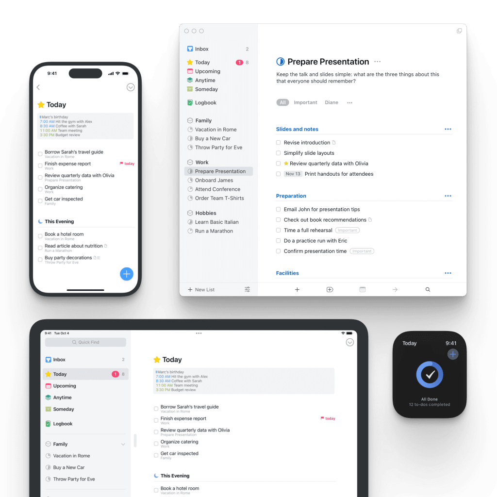
Notice they don’t go very heavy at all on UI for adding new items. A tiny + on the desktop app and a blue (+) on the mobile apps. The emphasis is more on knowing that Command-N will do the trick. I do enjoy the little feature that you can drag the mobile (+) where you want it before adding a new item. Notably, you add a new item before you add any text or information to the item. Metadata is pretty limited, preferring that you group things in various ways (areas, projects, headings), although there is things like tags if you want them. If any metadata is emphasized, it is due dates.
Todoist
Todoist actually is web-based, so that’s nice to see (hey, you get multi-platform for free!).
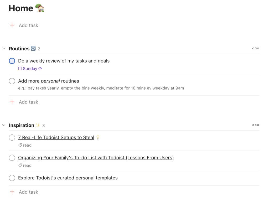
More metadata is exposed here. Tasks have a description which you automatically some of is interesting. Plus tags, plus due dates, plus collapsible groups.
Notice that adding a new task is also relatively chill. Unlike Things, pressing the + Add task button doesn’t automatically create a new task, but instead expands into a fleshed out task adder:

The task name is the only required thing, which makes sense. It would be obnoxious if anything else was. It feels like a reasonable choice to allow you to add all this metadata immediately, but certainly not the only path. They could do it such that you add the task first, then optionally add more to it if desired as an optional next step if you wanted.
TeuxDeux
TeuxDeux is big on having you put to-do items on individual days, although you can customize it if you want to. Having this kind of initially opinionated structure will have a huge influence on how people think about your app.
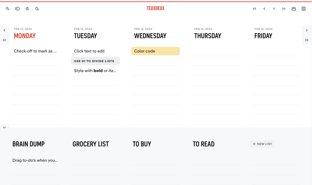
Notice there is almost no UI for adding new items. The way it works is that the next item in each column is automatically a live input, waiting for you get into it and add text. The extremely narrow item widths will also encourage you to get to the point darn quickly. You can see the markdown come through with the editing toolbar (Things also does Markdown, but only in the body of the description, which is hidden until opening an individual item.)
TodoMVC
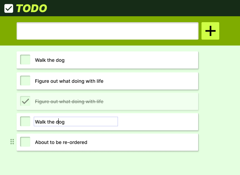
This is the standard design as part of that TodoMVC project I mentioned (example). This is fun, as it’s quite intentionally minimal.
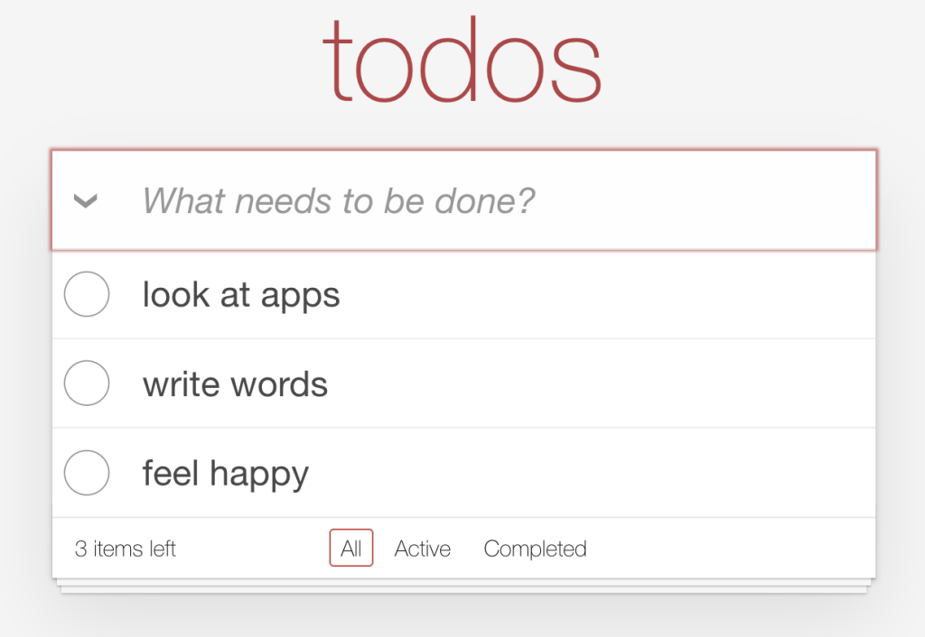
Note there is no submit/add button for new items, which weirds me out a little bit on the web. I’d say this then entirely relies on the submit even from the <form>, but in this case there is no <form> (?!), which then not only requires JavaScript but more JavaScript as they can’t just use that native event. It’s likely our app will require JavaScript as well, at least at first, as adding a backend language might be a trip too far for this series (but we’ll see, if y’all love it, lemme know).
Here we’re seeing implied categories based on completion (and a way to delete the cleared items as well). Plus a count. Plus the ability to double-click to edit. That editablity feels like a significant thing to think about. Does that double-click feel right or should you just be able to click in there? Native operating systems have a click-and-linger approach to name editing sometimes. You could certainly offer an “Edit” button (Pencil icon?) as well, but anything you add to every item is going is a risk of visual clutter. Reveal it on focus? Maybe there will be enough items to warrant a sub-menu? We’ll have to see.
Initial Features
There is no way we’re going to be as robust as some of these apps who have been working on their feature set for years and years. Let’s call it like this:
- Let’s emphasize the simple text input. Let’s see how easy we can make it to add a new item to one big single list.
- Let’s also emphasize the Add/+ button. Not only does it lean into HTML and accessibility correctness, but we can also make it part of our branding. Maybe we can borrow the Things approach of draggability someday.
- Just one big list for now, but let’s think extensibility when we store our data. It shouldn’t be a stretch to add multiple lists, tags, descriptions, or anything else.
- Add and Complete are the primary actions. For now, let’s borrow TodoMVC’s approach of double-click to edit unless we find something we like better while building.
- Let’s try and make drag-to-reorder happen.
Very basic.
Of course, we’d love to add user accounts, Markdown support, due dates, tagging, an API, bulk actions, recurring items, and who knows?? AI helpers? Integrations? If you absolutely knew that these features needed to be there for day one, then they should be part of the design process from day one. For us, not so much, so we’ll keep things simple and trim and build that first.
It’s fun to think about though! Heck, a to-do app, as simple as it seems at first, might be just as complicated or more than an app in just about any other genre.
Design
Knowing what a trim feature set we have, I’ll Figma something up real quick. Half an hour later, here we are.
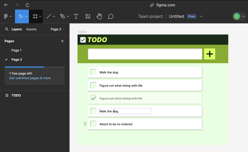
This artifact is a little useful. We can reference colors. We can be relatively sure we’ve represented what we wanted there for day one. But mostly, this forced us to actually think about all that before our greedy little fingers started coding.
We’ll code better if we more clearly know where we’re going.
Working design-first also frees up your mind, I find, to think more creatively. Personally, I’m happy to drag things around weird places. Pick weird colors. Make things humungous or tiny. Explore totally different icons. All sorts of stuff like that that I just know I’m much less apt to do once I’m actually coding. For lack of a better metaphore, a left brain / right brain thing. As you get to know how you work best and most creatively, you’ll have your own tricks.
See ya next time!
Article Series
- Building a TODO App from Scratch — Step 1 — Planning & Design
- Building a TODO App from Scratch — Step 2 — HTML
- Building a TODO App from Scratch — Step 3 — Basic JavaScript Functionality
- Building a TODO App from Scratch — Step 4 — Styling & Interactive Choices
- Building a TODO App from Scratch — Step 5 — Extra Functionality

